The Designer Gui Elements
The LLBLGen Pro designer is a 100% .NET application, which can run as a stand-alone designer or as an integrated designer in VS.NET 2012, 2013, 2015 or 2017. The designer consists of various different elements which are described briefly below. The complete GUI is made context aware and is reflects any change made anywhere in the UI and everything is kept in sync: e.g. changing a name of an entity will propagate that change to all other GUI elements which show that name. Of course you can undo your changes at any time using the Undo / Redo feature.
The LLBLGen Pro Designer requires .NET 4.5 or higher to run.
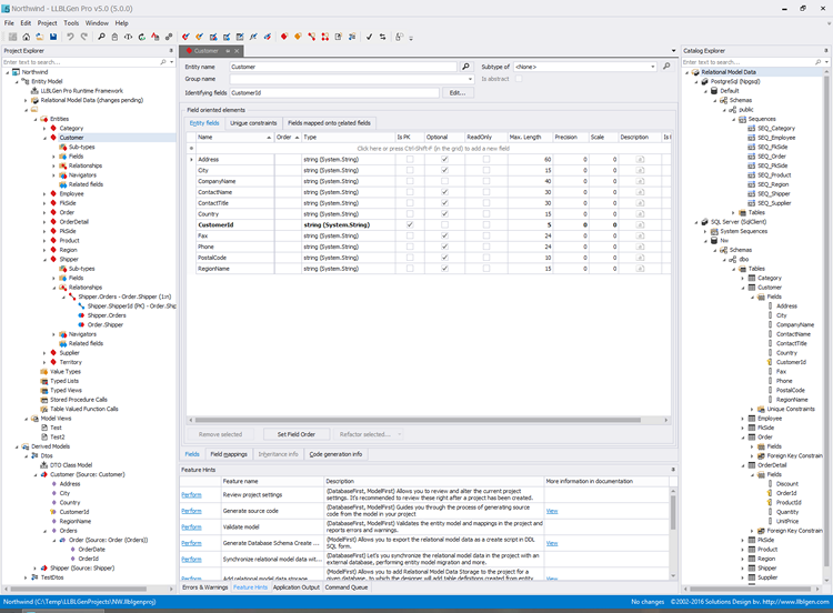
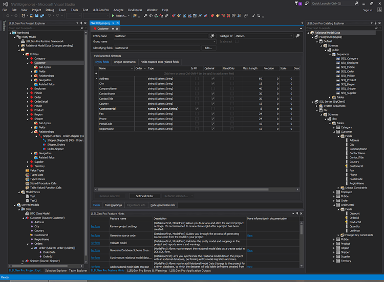
Below the designer is displayed as standalone and as integrated inside VS.NET with the various parts highlighted.

The LLBLGen Pro designer, standalone

The LLBLGen Pro designer, integrated in Visual Studio, using Dark Theme
Gui elements
The following main areas are recognizable
- Project Explorer. The project explorer is the central viewer of the elements in your LLBLGen Pro project and the entrance point to for performing actions on these elements. You can compare it with the 'Solution Explorer' in visual studio. LLBLGen Pro has a project explorer which is multi-selection aware and offers a rich feature set per node through context menus. See Project Explorer for more information.
- Catalog Explorer. The Catalog Explorer is the central viewer for the Relational Model Data in your LLBLGen Pro project and the entrance point for performing actions on these elements. LLBLGen Pro's catalog explorer is multi-selection aware and offers a rich feature set per node through context menus. It's a very important part of the designer especially for users who want to work database-first. See Catalog Explorer for more information.
-
Tabbed Editor Area. This area is the main area of the MDI
docking environment of the LLBLGen Pro designer. All editors are
opened here, also if you're working inside VS.NET. You can browse
through the tabs via
Ctrl+TABandCtrl+Shift+TAB, or by using the Windows menu. To close tabs, use the close button at the top right of the tab area, useCtrl+F4, use the context menu of the tab header by right-clicking the tab header or use the Window menu. - Docked output panes. This area contains the Errors & Warnings pane which is used to display errors and warnings discovered through validation, the Feature Hints pane, which is used to list a context-aware list of actions to perform, the Application Output pane which is used by several components in the designer to list output to the user. It has a checkbox for Verbose output or not, a setting which can be controlled via a setting in the designer preferences.
- Toolbars. The toolbars contain the most used menu options from the main menu of the designer for easy access.
Themes
The v5 designer is fully themable / skinnable and ships with a variety of themes. By default it uses the 'VS.NET light' theme. To switch themes, go to Edit->Available Skins and select the theme you like. The theme chosen is persisted with the Gui state automatically.
VS.NET integration and themes
If you use the designer inside VS.NET, it will chose the theme matching the theme used by VS.NET itself. This means that if you use the 'Blue' theme in VS.NET the designer parts also will use the 'VS.NET Blue' theme/skin. If you use a custom theme inside VS.NET created by an extension, the designer will fall back to its default, 'VS.NET Light'.